- DATE:
- AUTHOR:
- The Session team

Some New Features and a TON of improvements
We're excited to share some updates on what's new in Session! 
Clickable On-Screen Messages
 Hosts can now highlight links to attendees in the session, as a means to draw more attention to links shared in the chat. These links can then be displayed to attendees on the recordings page, alongside chat and Q&A as well.
Vertical Video Tiles
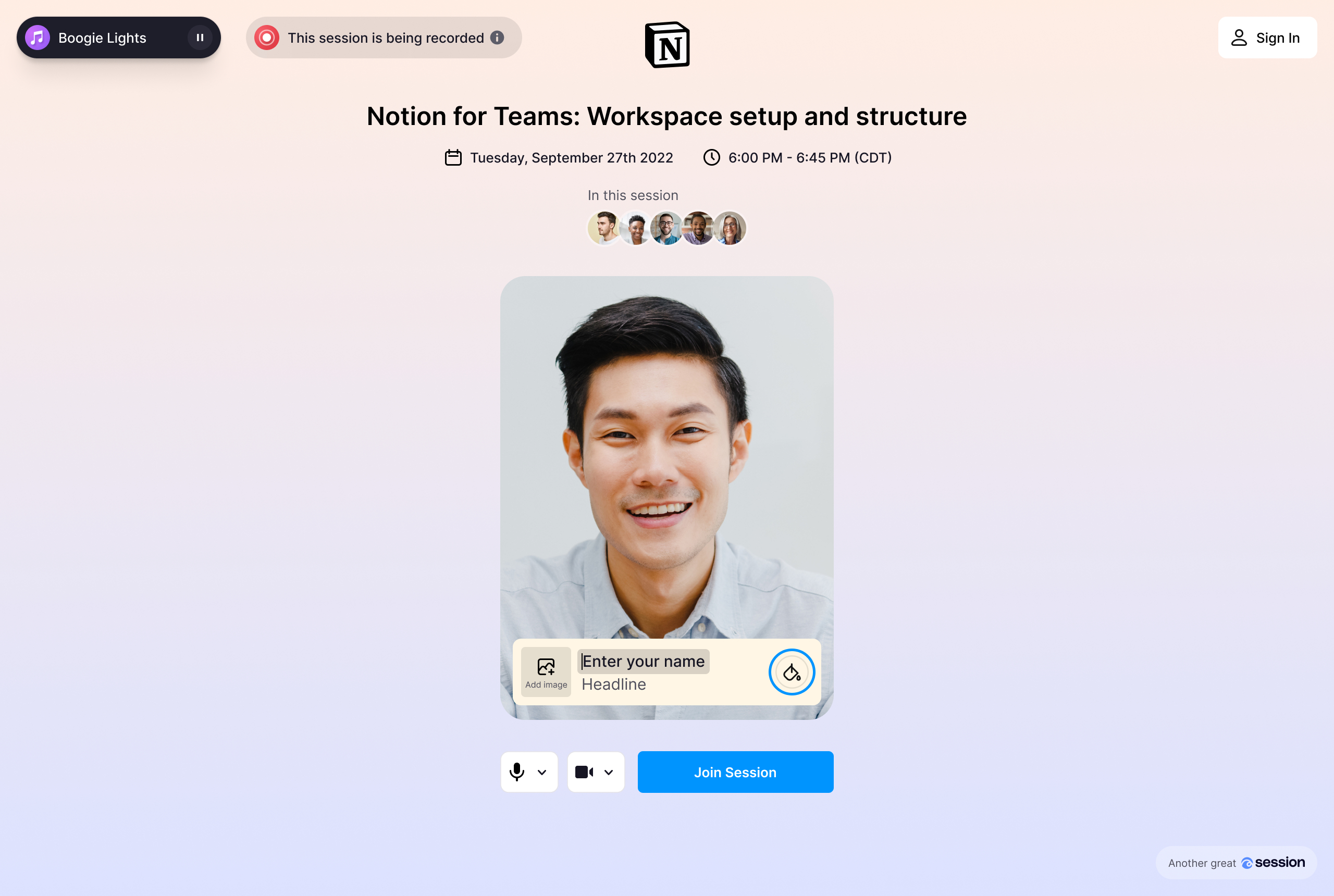
 With the world turning to the beauty of the portrait aspect ratio in product such as TikTok, we decided to do the same. All users now have vertical video tiles set as their default, and can also toggle between vertical and horizontal aspect ratios from their video settings menu when needed.
Alongside this change, we also updated the look and feel of the joining experience, so you'll see a new fresh UI there too!

Annual Pricing
 We've not only launched a new annual pricing plan, but also are offering a limited time discount on it too! Learn more at https://www.session.com/pricing

Notable Improvements & Bug Fixes
We have made a ton of improvements across the product (thanks for your continued feedback and bug reporting!):
Session registration links are now auto-shortened, so hosts can now share clean links

Refreshed the UI of audio and video settings menus with a new layout and toggles
Moved the attendee gallery to the left side in certain larger screenshares
Added a theme label to session/room cards in the dashboard
Added a leave room button in the webinar theme in-room toolbar
Show a border around the active speaker in all themes (when there are 2 or more users in a session)
Refreshed UI for the host controls panel to make it simpler to access and use widgets
Organizers can toggle to display highlighted links, chat, and Q&A on the attendee recording page
New 'contact us' experience in the product to make it easier to ask for help
Added captions to the webinar theme
Added custom branding to automated emails, so that the registration page banner and logo appear throughout
Session calendar invites no longer have a long link in the description
Screenshare tiles now only display the name of the user upon hover
All passcode-protected sessions now show the passcode (rather than an authId) in the url
Disabled breakout groups in large sessions greater than 250 attendees
Organizers are now redirected to their session history page when they leave or end a session
Fixed the positioning of highlighted chat messages in the room
Past sessions are now eligible to be synced to HubSpot
We increased attendee support from 3K to 5K attendees for business plan customers
 Sign up to run your own session at session.com